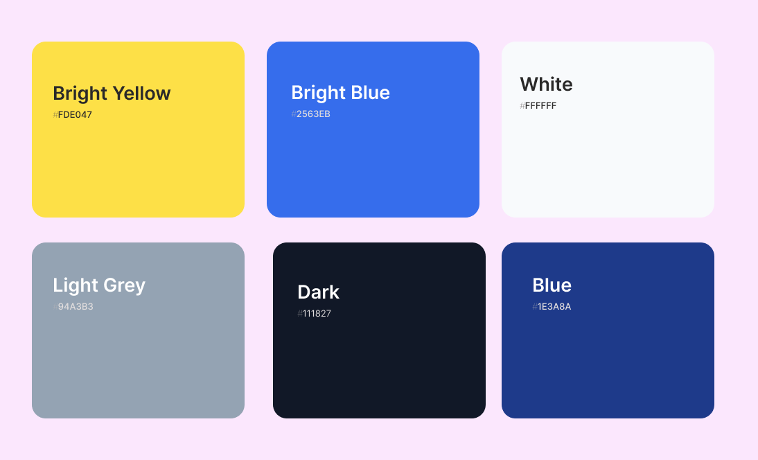
School Landing Page: Simple design, strong connection.
Peach Grove
Educational, NGO, Design, Web app
Project summary
In 2024, we launched a website for a school that sought a simple yet engaging online presence. The school’s vision emphasized a clean, understated design that subtly conveys their unique story without overwhelming visitors.
Our goal was to create an intuitive platform that highlights the school’s values and achievements, allowing users to easily navigate through essential information while appreciating the institution’s narrative. This approach not only enhances user experience but also fosters a deeper connection between the school and its community.
Problem
The school's previous website lacked a cohesive brand identity and failed to effectively communicate the institution's unique story and values to its target audience. The disorganized information architecture and outdated design created a disconnected user experience, making it challenging for prospective students, current families, and alumni to find essential information and develop a strong emotional connection with the school.
Furthermore, the school's staff faced difficulties in updating the website regularly, hindering their ability to maintain an engaging and current online presence. This limitation prevented the school from effectively showcasing its latest achievements, upcoming events, and other important updates to its community.
Challenges
In 2024, a school sought a simple yet engaging online presence that would effectively communicate their unique story and values to their community. The school's vision emphasized a clean, understated design that would subtly convey their identity without overwhelming visitors.
The challenge was to create an intuitive platform that highlights the school's achievements and fosters a deeper connection between the institution and its stakeholders, including prospective students, current families, and alumni.
Workflow scenario
A prospective student visiting the school's website for the first time would likely feel overwhelmed by the cluttered layout and outdated design. They may struggle to navigate the website and find information about academic programs, extracurricular activities, and the school's overall culture and identity.
Similarly, a current parent seeking to stay informed about their child's school events and announcements would likely encounter challenges in locating the relevant information, leading to frustration and a disconnected relationship with the institution.
The school's alumni, who seek to maintain a strong bond with their alma mater, may find the website's lack of engagement and outdated content discouraging, ultimately limiting their involvement and support for the school.
Solutions
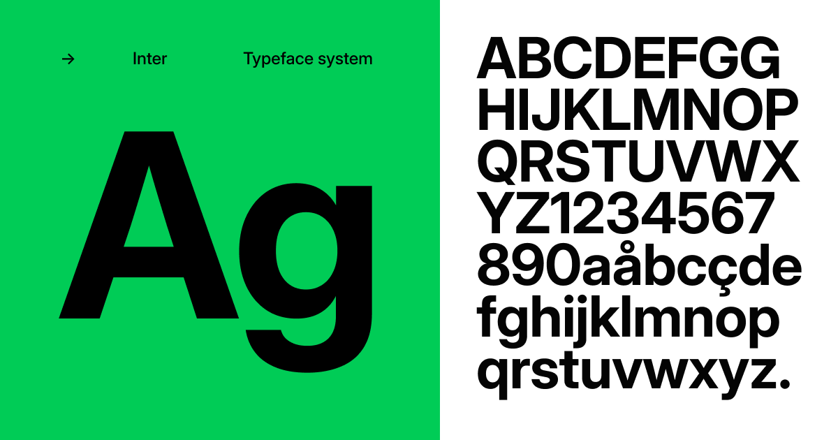
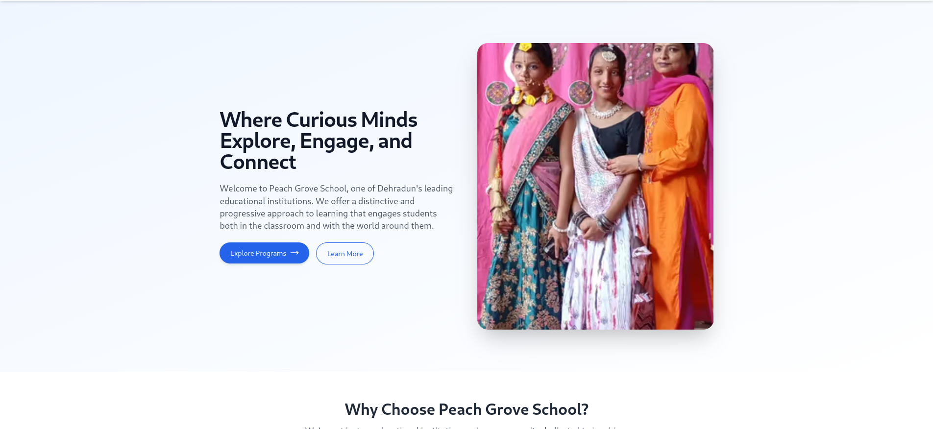
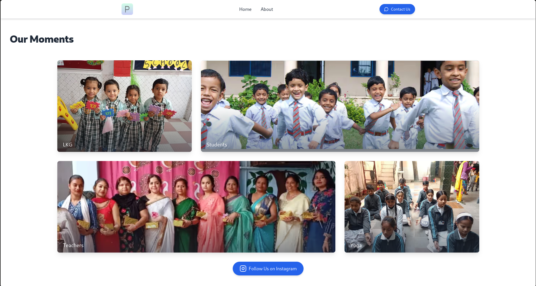
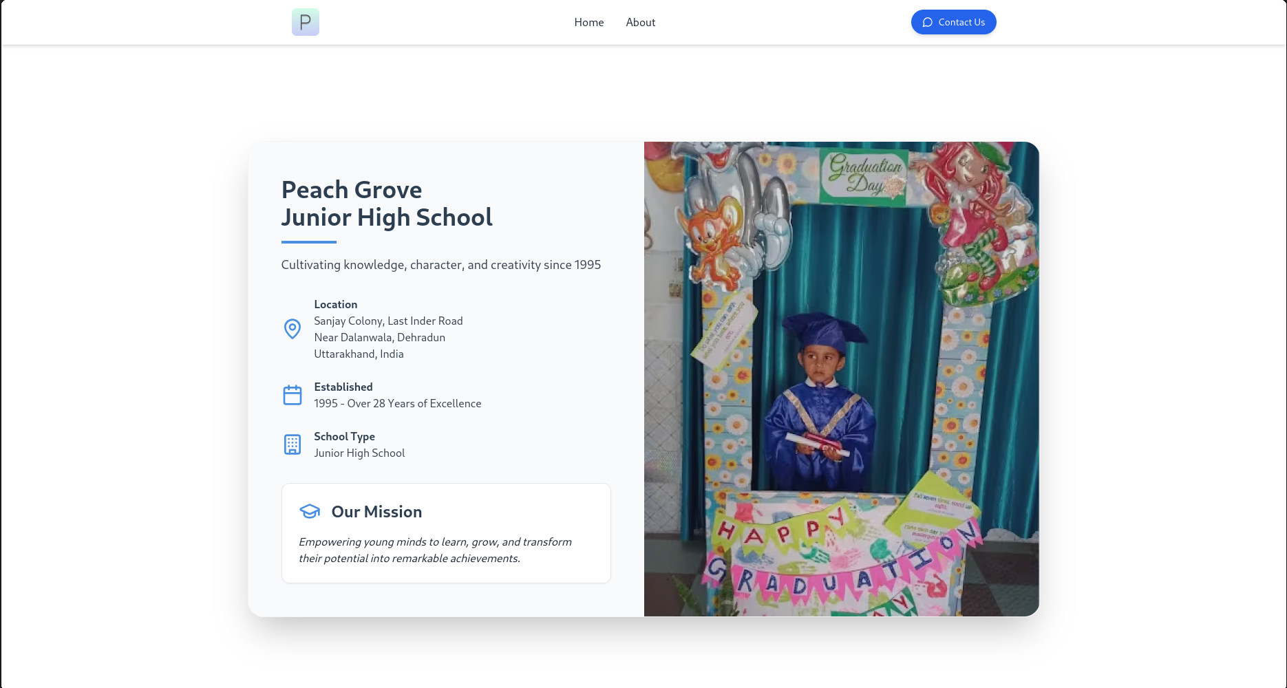
The resulting website showcased a minimalist, yet visually appealing design that complements the school's brand identity. By leveraging a clean typographic hierarchy, subtle color palettes, and thoughtful use of multimedia elements, the design agency created an online presence that is both visually captivating and highly functional.
The website's responsive design ensures an optimal user experience across various devices, allowing the school's community to access information and engage with the institution anytime, anywhere. Furthermore, the integration of dynamic content management capabilities empowers the school's staff to update the website easily, ensuring its relevance and currency.
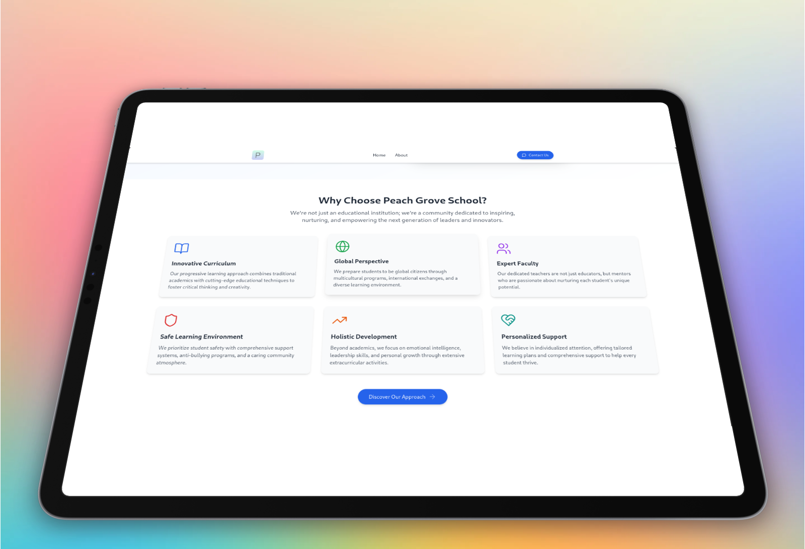
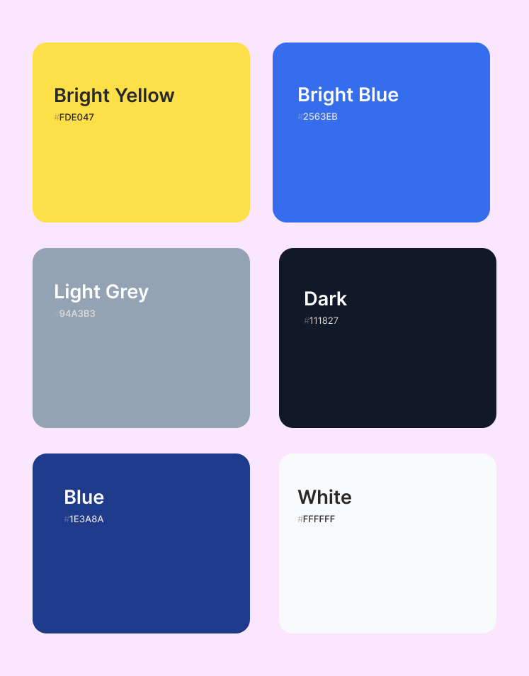
Graphic colors and styles
The color chart draws inspiration from the flagship design of the
project.
The background colors harmonize to create a cohesive
palette, complemented by a distinct accent color.
Final product
- Developed a clean, minimalist website that aligns with the school's brand identity and vision
- Crafted an intuitive information architecture and navigation to provide users with easy access to essential information
- Implemented a responsive design to ensure an optimal user experience across various devices
- Integrated a content management system to empower the school's staff to update the website easily
- Received overwhelmingly positive feedback from the school's community, including prospective students, current families, and alumni
- Positioned the school's website as a powerful tool for fostering engagement, enhancing reputation, and strengthening the bond between the institution and its stakeholders

Still thinking whether we're right for you?
Let's start a conversation and find out how we can bring your vision to life.
20+
Projects Delivered
95%
Client Satisfaction
24/7
Support & Care
Ready to get started?
Schedule a free consultation call or drop us a message.
Usually respond within 24 hours
