From Fear to First Click
How we engineered a dental website that calms nerves and books appointments
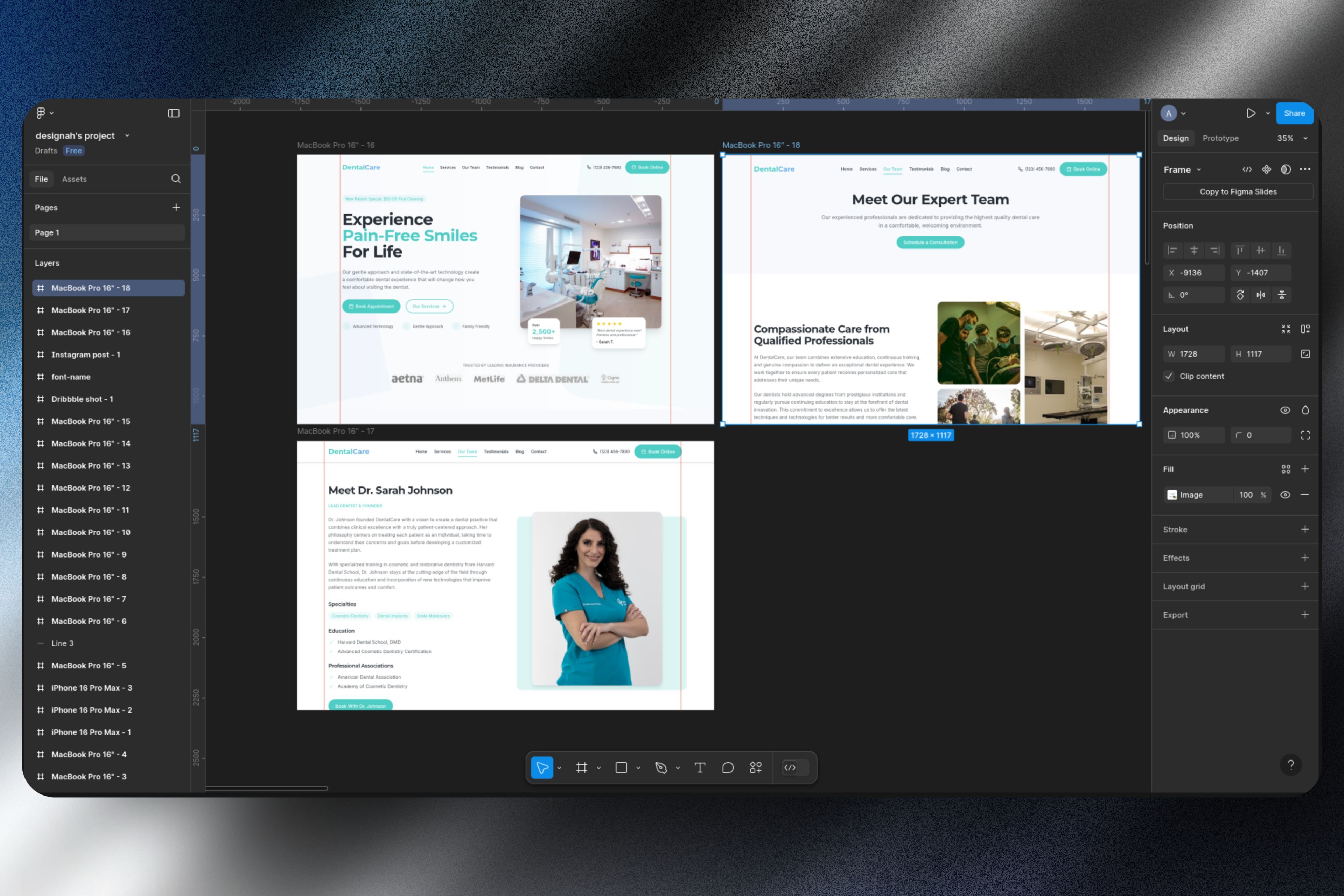
1. The Patient Pain Points We Solved
DentalCare had 4.9-star reviews but their old site suffered from:
- 37% booking abandonment (complex forms)
- "Sterile" aesthetic that amplified patient anxiety
- Mobile experience like a 2008 flip phone
We prescribed a digital experience as polished as their ceramic crowns.
Designah Principle #9
"Healthcare UX Should Comfort First, Convert Second"
We design for white-knuckled phone grips.
Standard Dental Sites
Why most fail patients:
- Stock photos of creepy perfect smiles
- Buried insurance information
- No pre-appointment reassurance
Our Treatment Plan
Evidence-based improvements:
- "Meet Your Dentist" videos before booking
- Pain scale for emergency appointments
- SMS confirmations with prep instructions
2. Designing for White-Knuckled Patients
Color Therapy
Our clinically-informed palette:
- #FFFFFF (Hospital White) for sterility signaling
- #0052CC (Trust Blue) for CTAs (proven in healthcare UX studies)
- 15% warmer white on staff photos (reduces clinical coldness)
"Anxious patients shouldn't have to decipher your menu."
Typeface as Medicine
Why Inter was the perfect RX:
- High x-height boosts readability for older patients
- True italics don't distort medical terms
- Open counters prevent visual crowding
Clinical Insight
We used 1.5x line spacing—critical for patients reading through dental anxiety.
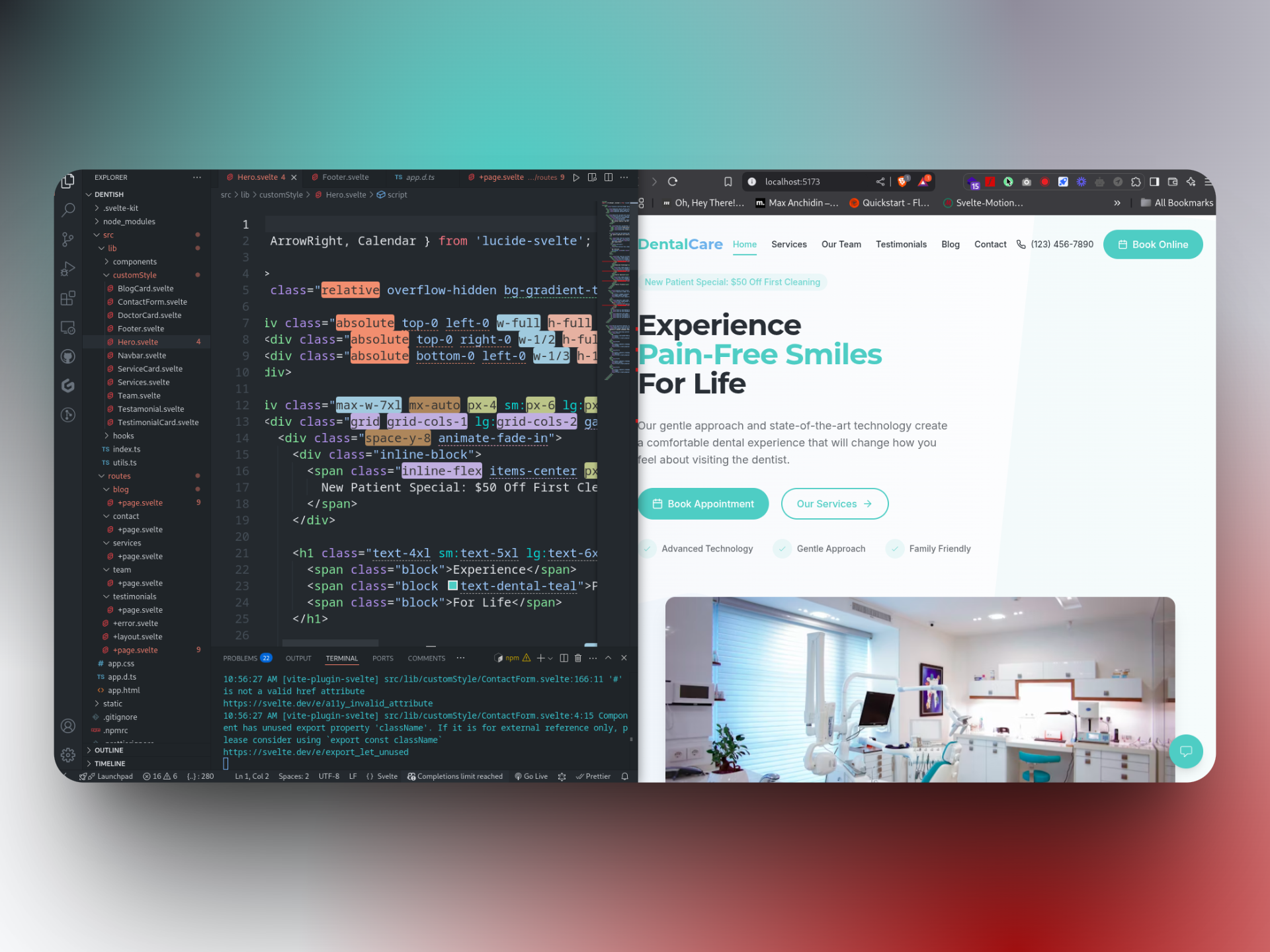
3. Technical Hygiene That Booked Appointments
Online bookings first month
Average page load time
Reduced front-desk calls
The Booking Breakthrough
Dental websites typically lose 42% of patients at:
- Insurance verification steps
- Unclear emergency availability
- Lengthy medical history forms
Our solution? A progressive SvelteKit form that saved progress and auto-scheduled follow-ups.
Why This Redefines Healthcare Websites
For Dentists
Your website should be your best hygienist:
- Calms nerves before they arrive
- Answers FAQs without staff time
- Books appointments during late-night anxiety
For Our Team
This project taught us:
- Healthcare UX requires empathy metrics
- Speed isn't a luxury—it's patient care
- The best compliment? "This doesn't feel like a medical site"
Does Your Practice Deserve This Upgrade?
Get our free "Healthcare Website Checklist" with 17 conversion-boosting features most clinics miss.
Still thinking whether we're right for you?
Let's start a conversation and find out how we can bring your vision to life.
20+
Projects Delivered
95%
Client Satisfaction
24/7
Support & Care
Ready to get started?
Schedule a free consultation call or drop us a message.
Usually respond within 24 hours
'%3e%3cpath%20fill='url(%23paint0_linear_133_2)'%20fill-rule='evenodd'%20d='M50.714%200h-50v50c0%2025.462%2019.033%2046.479%2043.647%2049.6C19.401%20102.402%200%20123.578%200%20149.286v50h50c25.462%200%2046.479-19.033%2049.6-43.647%202.802%2024.96%2023.978%2044.361%2049.686%2044.361h50v-50c0-25.462-19.033-46.479-43.647-49.6C180.599%2097.598%20200%2076.422%20200%2050.714v-50h-50c-25.462%200-46.479%2019.033-49.6%2043.647C97.598%2019.401%2076.422%200%2050.714%200Z'%20clip-rule='evenodd'%3e%3c/path%3e%3c/g%3e%3cdefs%3e%3clinearGradient%20id='paint0_linear_133_2'%20x1='27.5'%20x2='149'%20y1='19'%20y2='174.5'%20gradientUnits='userSpaceOnUse'%3e%3cstop%20stop-color='%23FFD9A0'%3e%3c/stop%3e%3cstop%20offset='1'%20stop-color='%23FFF5F1'%3e%3c/stop%3e%3c/linearGradient%3e%3cclipPath%20id='clip0_133_2'%3e%3cpath%20fill='%23fff'%20d='M0%200h200v200H0z'%3e%3c/path%3e%3c/clipPath%3e%3c/defs%3e%3c/svg%3e)